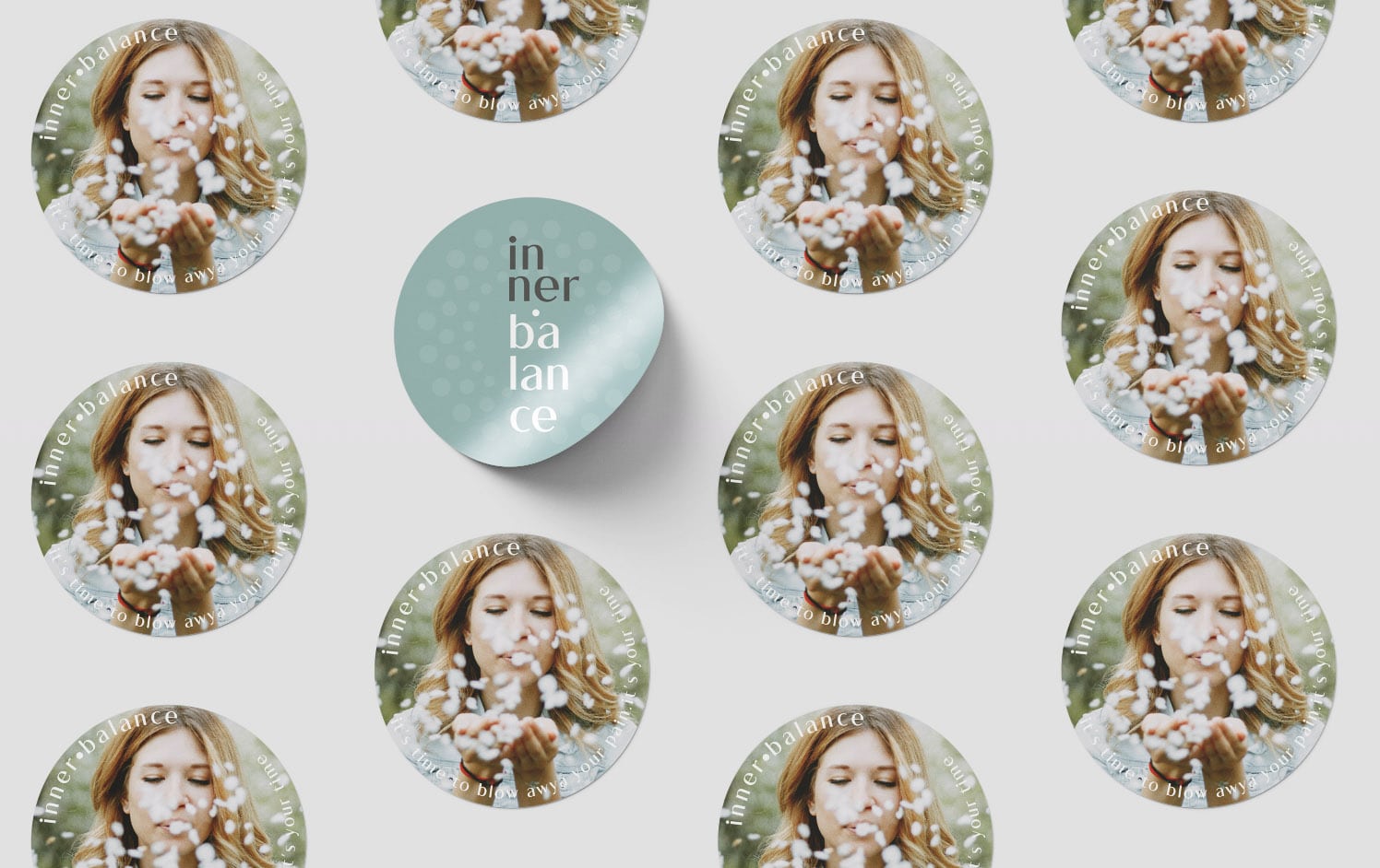
Blowing away the pain with Chinese Medicine treatments. For a better life where alternative medicine could play an important role in our healing.
client:Juliana Reis industry: Health and Wellbeing – UK year: 2022 capabilities: Brand identity, Design Strategy, Product Conception, Consulting
briefing: Juliana is a fully qualified acupuncturist and Chinese Medicine practitioner who decided to implement her project Innerbalance to help her clients. She recognised the need to differentiate herself in a competitive market and contacted me to help with her idea. More than a brand she was looking for a business and communication plan to promote her services. In fact, she needed some help with the overall project – to know what to do and how to start.
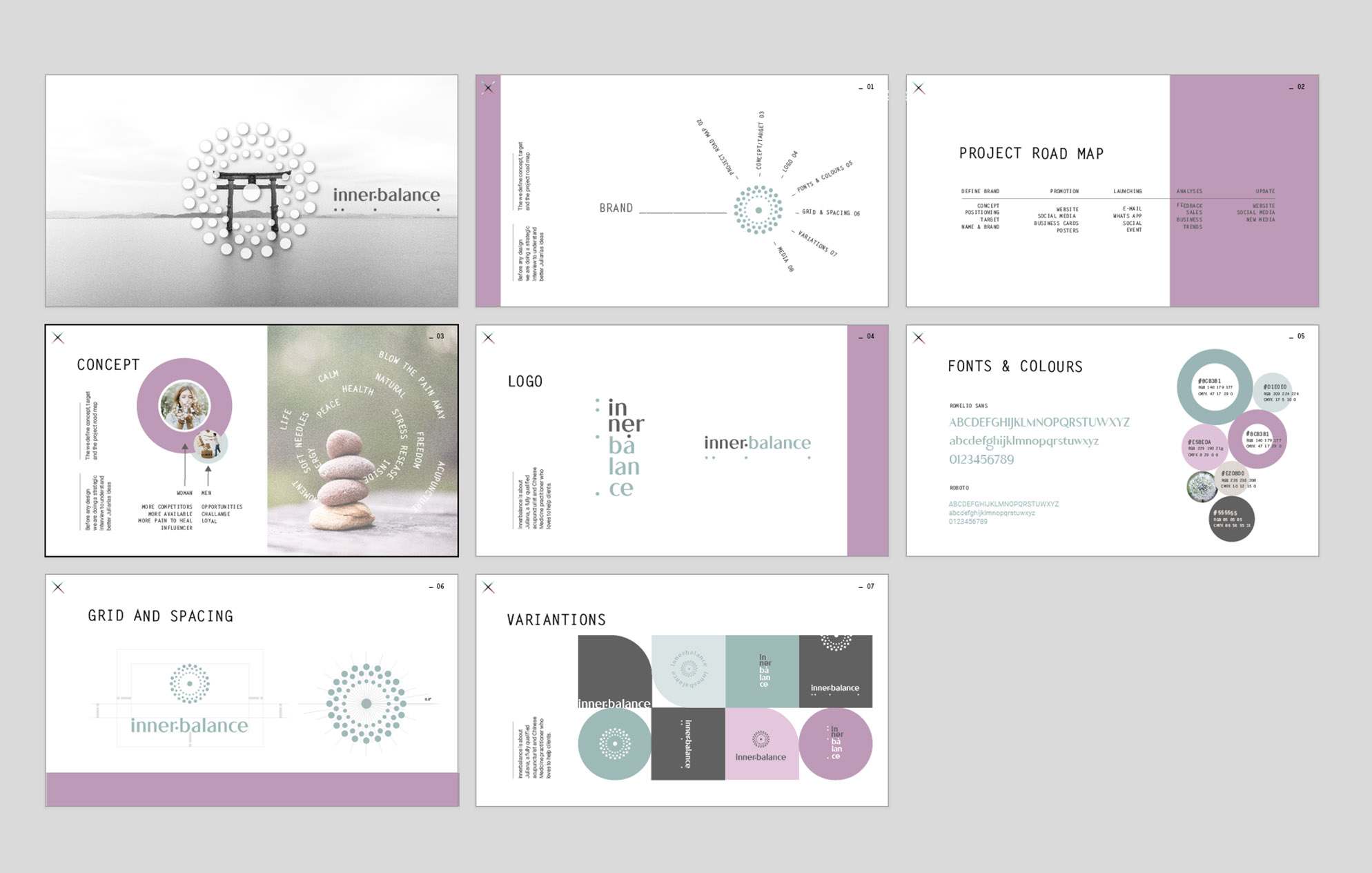
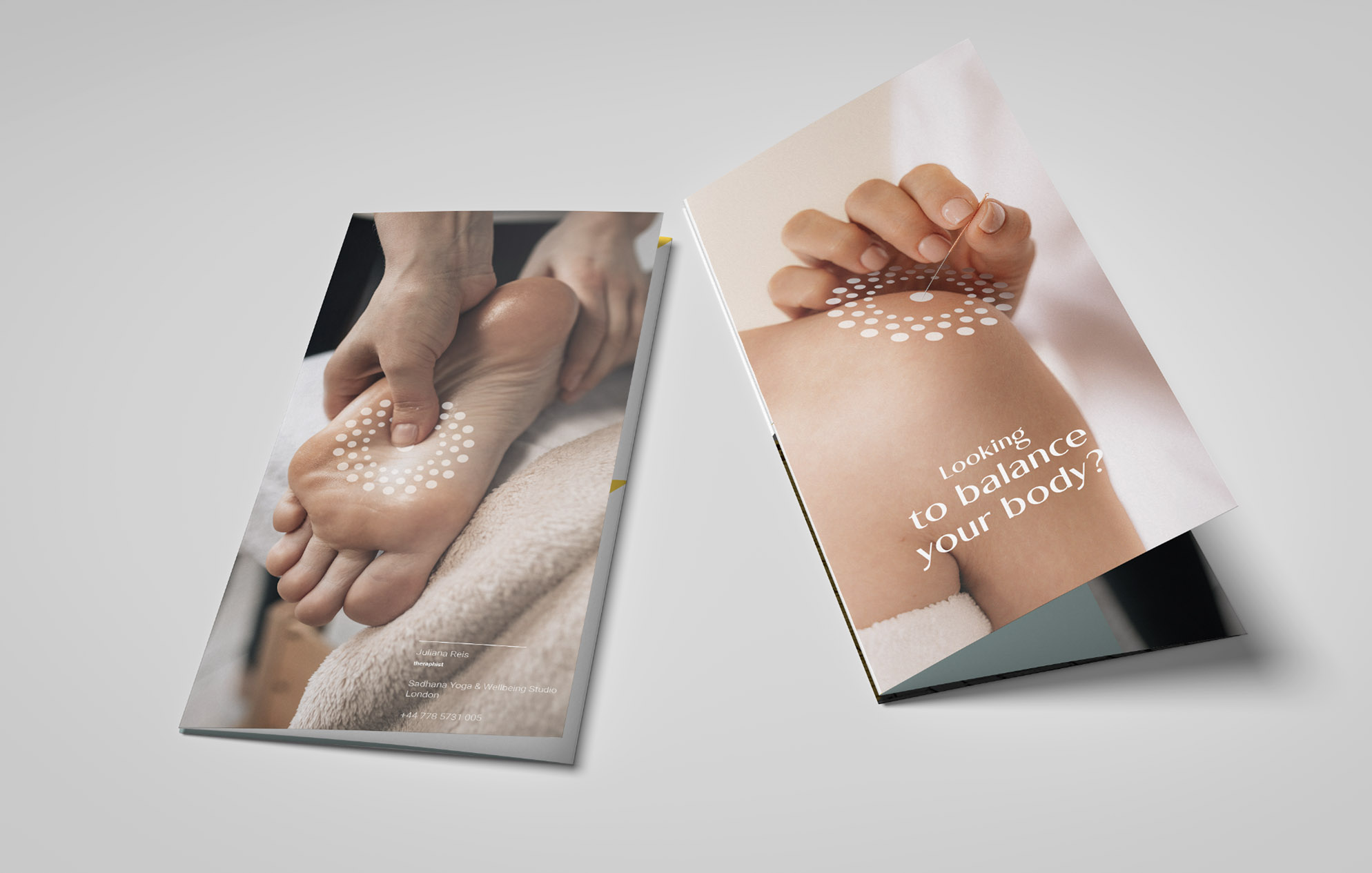
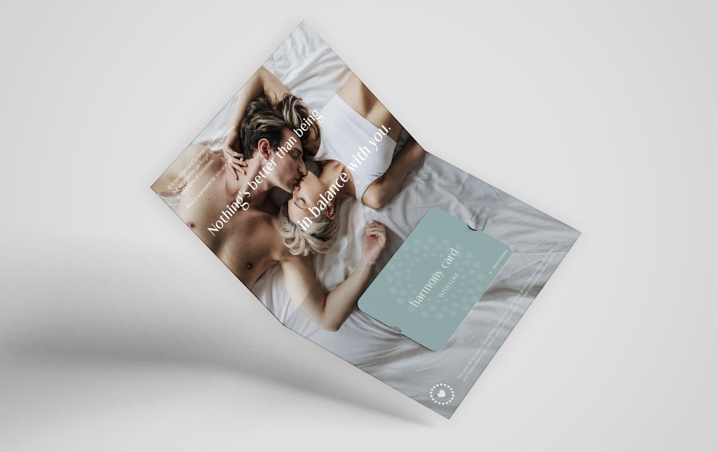
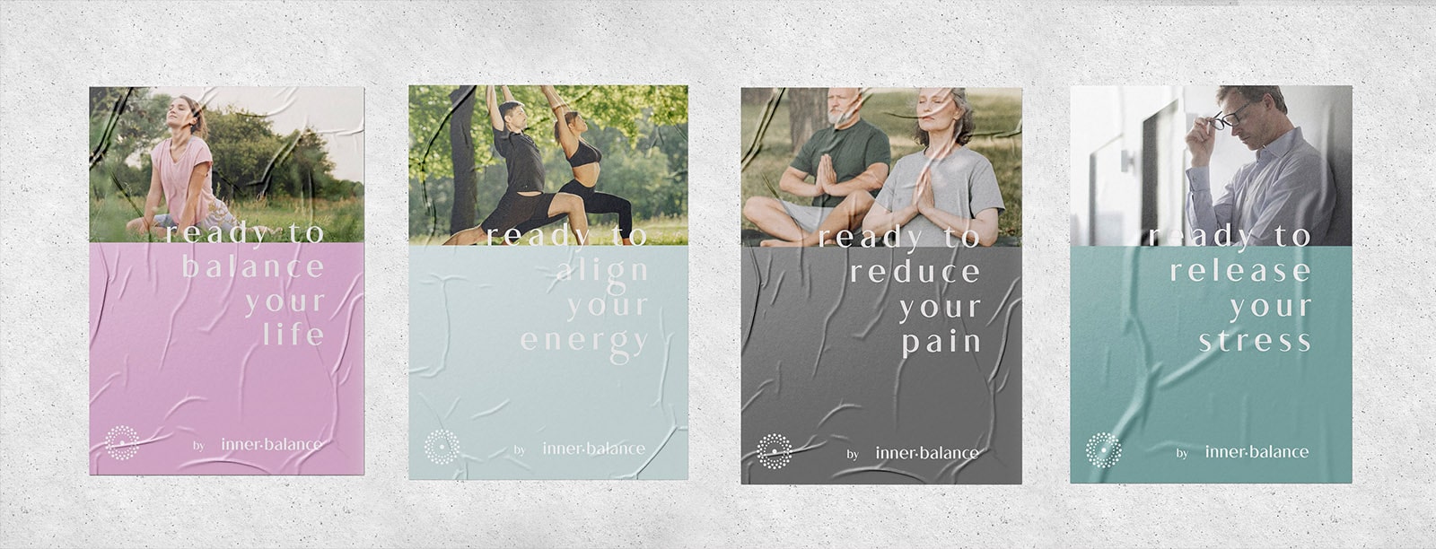
brand positioning: The brand process started with a brief interview with Juliana and a deep dive into understanding the patients’ pains and fears. Their acceptance of new treatments or therapists. Also, acupuncture treatments can be difficult to promote because not everybody believes in their effective effects and the needles are not the kind of items to be in love with. We wanted a welcoming brand, relaxing, and approachable. A minimal but warm communication where the visuals resonate kind feelings of acceptance and belief. We used pastel colours in green and pink tones aligned with emotional and natural vibrations. Those tones harmonise as well with natural skin colour tones that are present across most of the imagery used. Low contrast between visual elements
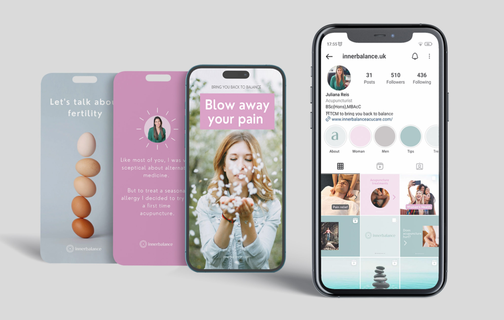
innerbalance services: The project is focused on acupuncture treatments but offers other services like massage, moxa and cupping. One session of treatment is not enough to see results so from a business point of view was essential to create packages combining services that can help specific problems. We decided to create kind names for the packages as well as icons that could illustrate those individually. It was essential to break the barrier of scepticism and fear, taking advantage of relaxing images and clean but warm visuals.
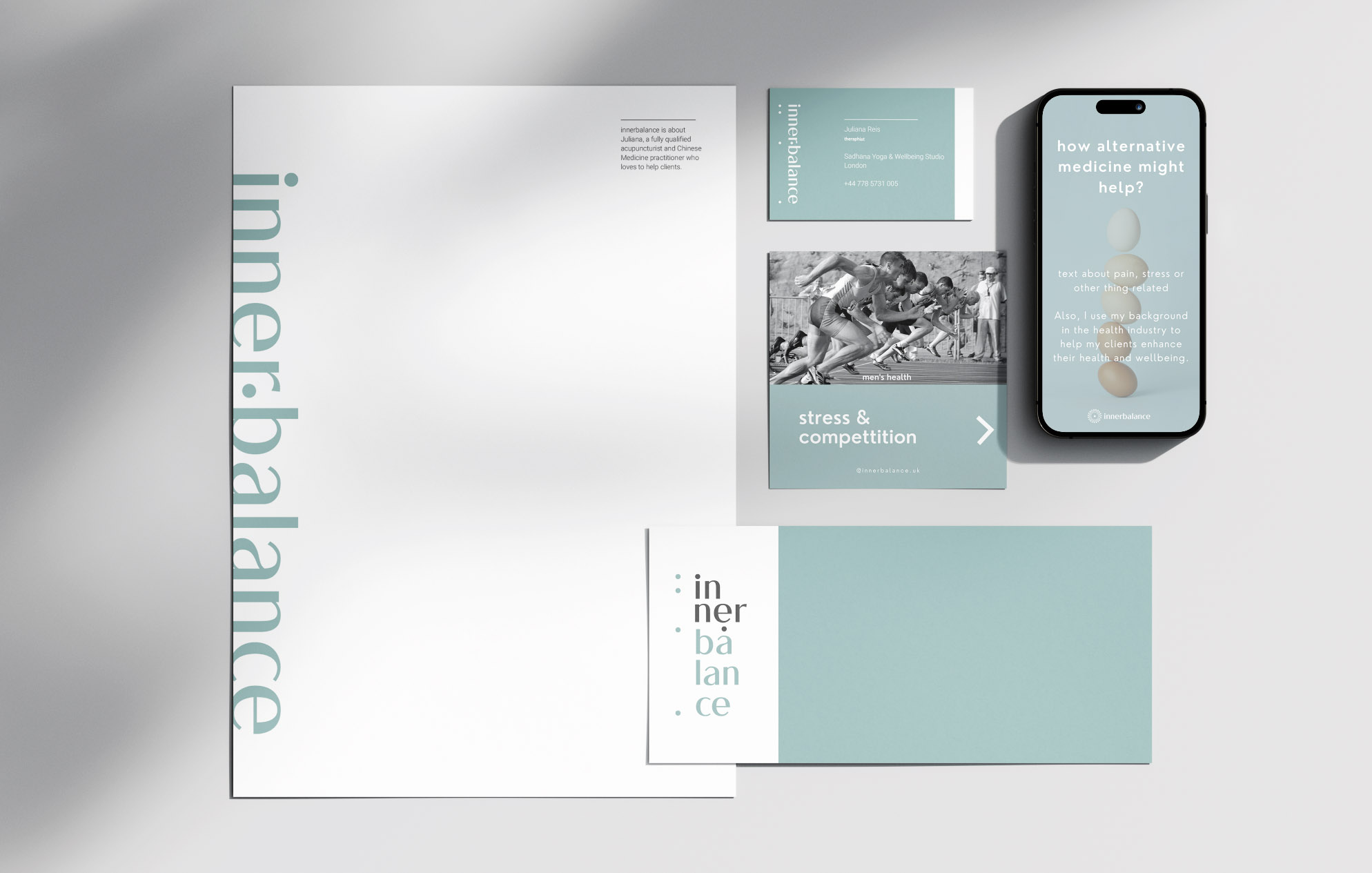
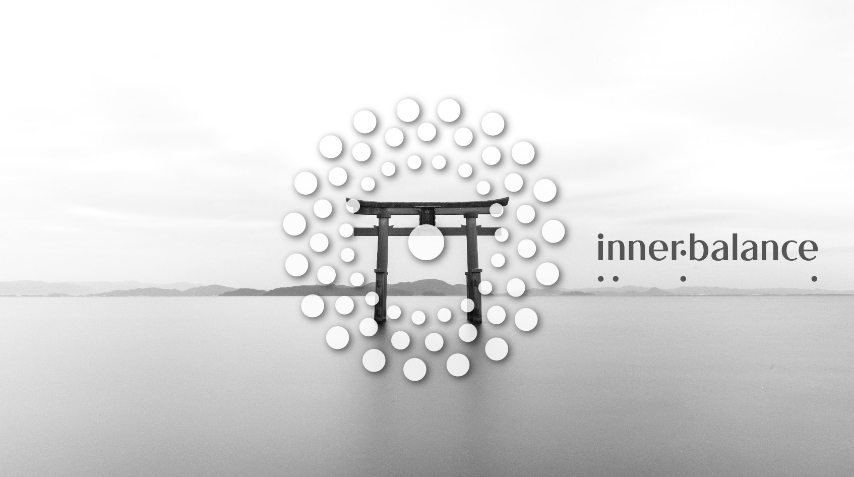
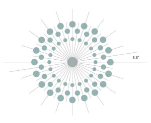
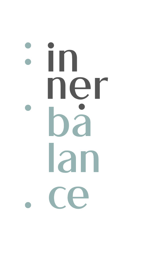
the logo: inspired by mantras and the shape of a dandelion, the flower made up of needle-like structures arranged in a geometric pattern that goes away when we are blowing with a gentle breath of air. The concept aims to evoke a feeling of relief. Exhaling that means releasing pain as a liberating and soothing experience. Also the icon represents the energetic point balance and connection. We used an elegant clean but warm typeface combined with dots that represent the energy points. The colour palette combines soft neutrals with light pink and green, gentle pastels to resonate with the ideal concept environment.
the process: Juliana was looking for a person who could help from scratch. Sharing some market and client management experience, and building roadmaps and plans to make Juliana’s business flow successfully were the main tasks. Through some interviews, workshops and assistance calls I collaborated with Juliana on refining her vision and developed a design strategy that involved a gradual implementation. We defined the type of services, packages, ideal client and the essential tools to manage all the steps.
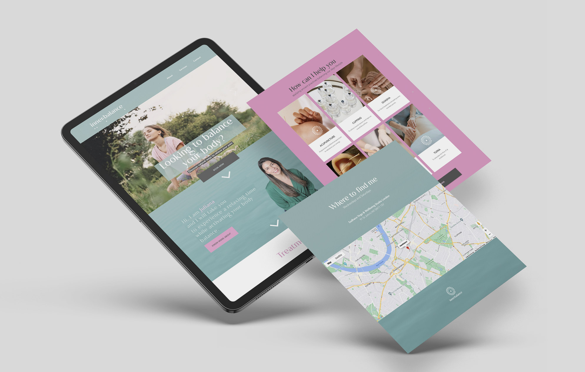
material: We’ve crafted custom illustrations and names for each treatment service to simplify and enhance user engagement. These tailored visuals offer an intuitive identification of different packages and options. Using images picturing real-life scenes to engage emphasising the importance of treatments in our routine. Online we created a bespoke website where the patients can understand the effect of each treatment, the session procedures and important information about the practices and the therapist. We combined real-life images, icons, the pastel tones paired with a visual system to ensure the brand is always welcome and approachable.